Grids are a concept that most modern developer or designer will be familiar with - they provide the basis for how we can build responsive layouts without too much of a headache. Bootstrap is perhaps the most familiar and recognisable, however CSS has now evolved to include modifiers such as flexbox and grid that means we don't have to rely too heavily on frameworks such as Bootstrap in order to build grid based sites.
One of the clever aspects of Umbraco, is how they've managed to build within the CMS's back office, a grid system to match the grid in the front end. This gives quite a bit of freedom to both the developers. the designers but most importantly now the editors too because it means that editors have a system of building content using grid blocks that translates stylistically and conceptually from backend to front.. and it means editors don't have to be restricted by a set of templates and document types with fixed, prescribed layouts - but instead editors can have the freedom to build their own layouts and choose how their content is structured.
There is inherent danger within this approach of course, because it relies upon content editors being sufficiently skilled and knowledgable in web design and content techniques. Granting the editors such flexibility also means granting the risk of building poorly structured pages that become a UX nightmare - so it very much depends on the approach that those with the responsibility for running the website want to take with how their content is managed and whether their content editors are capable of managing a site with this kind of flexibility or whether they should be operating within a much more controlled 'fixed template' environment.
The way I approach building websites with Umbraco now - is to think first about the type of control the owners of the site want and how much time and effort they are going to spend on the content. There are many sites I've worked on that the grid system would just be a waste of time in developing because the content is generally static and rarely changes. This is a common issue particularly with sites in the public sector where there is often no direct link between revenue and content, and instead sites are built more as information resources irrespective of the amount of traffic they receive. Similarly sites such as blog or portfolio sites will have content changes aplenty, but no real need for layouts that can change.
DocTypeGridEditor
It wasn't until I started using the excellent DocTypeGridEditor that really opened up the possibilities with the Grid system. Prior, the grid was a nice way of creating some grid based page blocks for some of the basic data types such as a heading using a text box or RTE content. It is pretty straight forward to configure and easy enough to implement in order to get content onto a page.
But - and it's a big but - you're totally at the mercy of the property editors as they exist and if you want to create a grid component that does something a bit funkier - then you either need to learn Angular.js real fast.. or give up with trying to use the grid.
Enter the DocTypeGridEditor - it really needs it's own duh duh duh type theme.. that bit in Raiders of the Lost Ark where Indiana Jones rides down the cliff on a white horse to chase the nazi's:
Yes DocTypeGridEditor - that is you.
The point of this is that the DocTypeGridEditor does exactly what it says (I love Web Developers sometimes - you could've called it something like 'McFizzy' but no.. instead opt for a name that describes it exactly - brilliant), it's a grid editor for.. wait for it.. document types!!
It may seem simple - and conceptually it is - being that rather than relying upon figuring out how to put a data type directly as a component within the grid, you can instead place it within a document type and with all its magic the doctypegrideditor will put the document type in the grid instead! It means you can create grid components based upon document types with multiple items.. and suddenly the worlds your oyster. Combine that with nested content - and...

Mind.. Blown
What the hell are you on about?
Lets go through an example building a grid component to display charts using a charting library (Highcharts.js, Chartist.js and many more use pretty similar syntax).
Firstly I have a basic document type containing a number of input types that allow me to make some choices about what is going to be displayed:
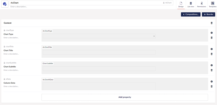
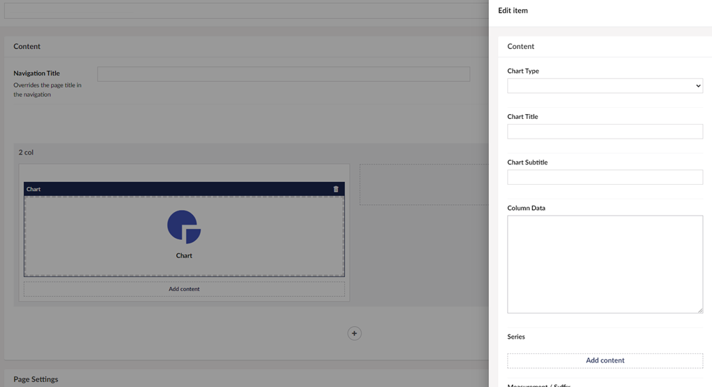
This is a simple setup allowing the editor to choose a chart type with a dropdown, give the chart a title, and paste some CSV data into a text area data type in order to create the data for the X data points which would give us our column titles.
We could just put another text area cell onto this document type and use it for the Y data points and this would be a sufficient demo if we wanted to demonstrate using the DocTypeGridEditor for a simple chart type such as a basic Histogram.
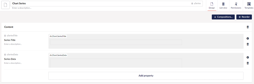
But for this demo I want to show you how DoctypeGridEditor can be used for more complexity. If you are familiar at all with charts you will know that a chart can have multiple lines of data, usually on the Y axis, known as 'Series' - so if we want something such as a stacked bar chart or a line chart with multiple lines - we need the functionality to have multiple series data.
In order to do this - we create another doctype to handle the series:
and then we can add this onto our original chart document type with the magic of nested content:
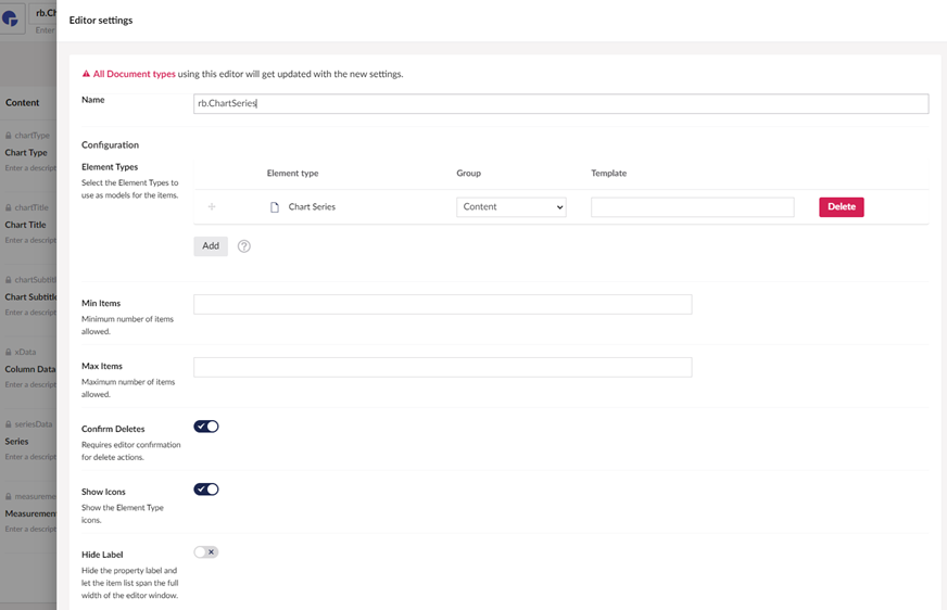
Once this is done, the chart series item appears on the document type. So far so 'standard-umbraco'. This would all work fine for a standard content page - but we're trying to turn all of this into a 'widget' or a 'component' that can be added into standard content - rather than being a fixed item.
Once you install DoctypeGridEditor into your project it will appear as a plug_in item within your front-end directory structure.
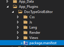
Much in the same way standard grid editor items can be added via a package.manifest - we can add doctypegrideditor items into our manifest:
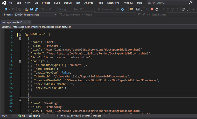
The key trick here is that the DocTypeGridEditor will work it's magic, and the document type you created will be transformed into a Grid Widget / Component.
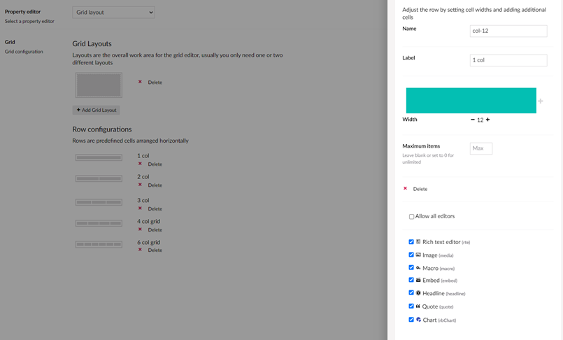
You won't be able to see it yet though, because you need to enable it within your Grid data type - and for each of the grid layouts you have, your list of editors will now include your chart document type:
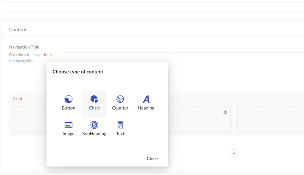
If we then look at how this translates in the editor view - by adding a chart item into a grid column element - we are then presented with our chart document type all compiled together in a nice new widget:
and upon selecting our new chart widget we can see that we get this new window with all the elements we added onto the document type:
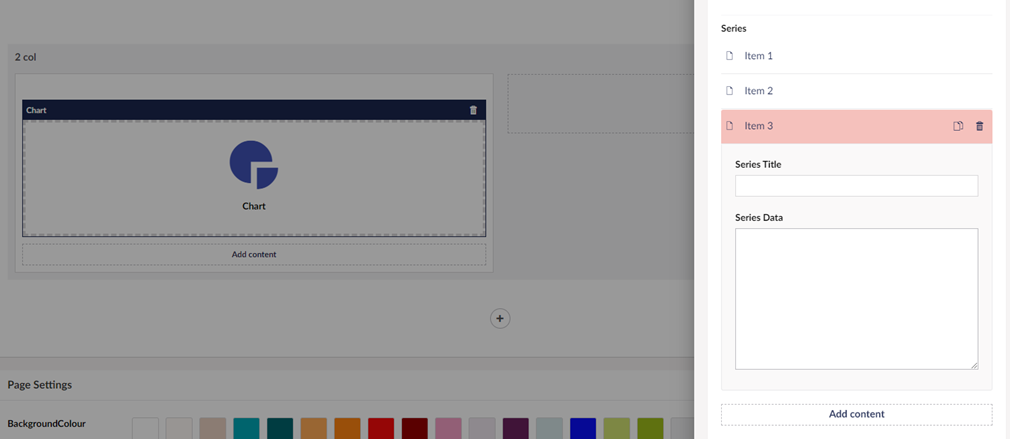
But the real power of the DocTypeGridEditor is in being able to bring in datatypes such as nested content that adds that extra dimension of functionality.
Remember the series nested content we added? We now have an element that allows multiple series of data that can be plotted using a .js chart library of choice.
Brilliant.
